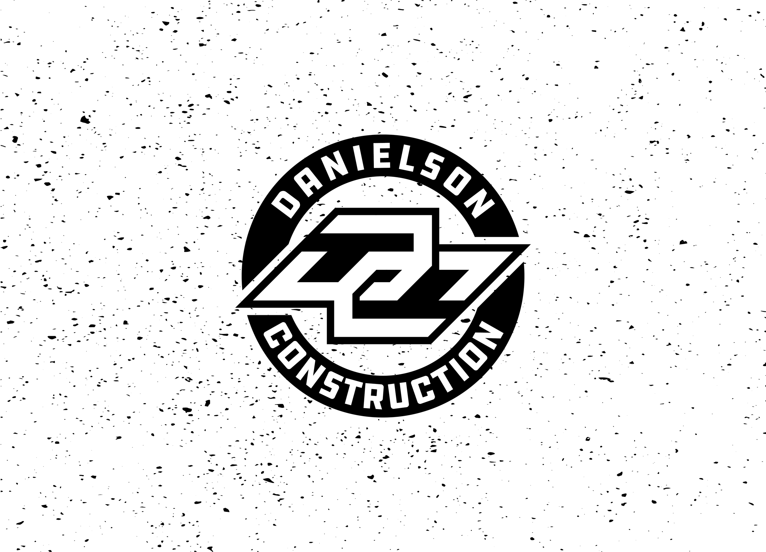
Danielson construction
Simple, that stands out.
That is what this client wanted. In a way, it sounds easy, but these kind of projects can be some of the toughest. When I thought about it, I knew I wanted to do some sort of monogram. I also wanted to go along the lines that a logo doesn’t have to be a literal representation of the industry that it is in.
When I look at this logo, it makes me think of something you would see in motocross, which I think looks sweet. If you know me, you probably know that I have some OCD when it comes to symmetry and precision. That’s why I love this DC part because it exemplifies both of those. Wrap it with a circular band, and you get a clean, simple badge that can be used for anything. Black and white is about as simple as it gets, and I think that it still pops!

Danielson Construction was formerly known as All American Concrete and Excavation, which I also created the logo for. When they decided to rebrand, I was honored that they came right back to me for a new look. Sometimes simpler is better!
Helping others with their own small business is what I love, especially ones with this kind of quality work!


